 DHIS PUNJAB
DHIS2 Dashboard
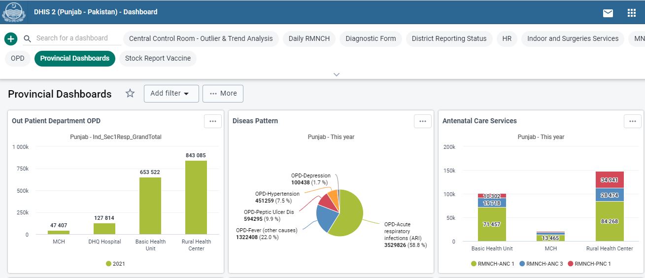
Dashboards are intended to provide quick access to different analytical objects (maps, charts, reports, tables, etc) to an individual user. Dashboards can be shared with user groups. Dashboards can also be printed
DHIS2 Maps
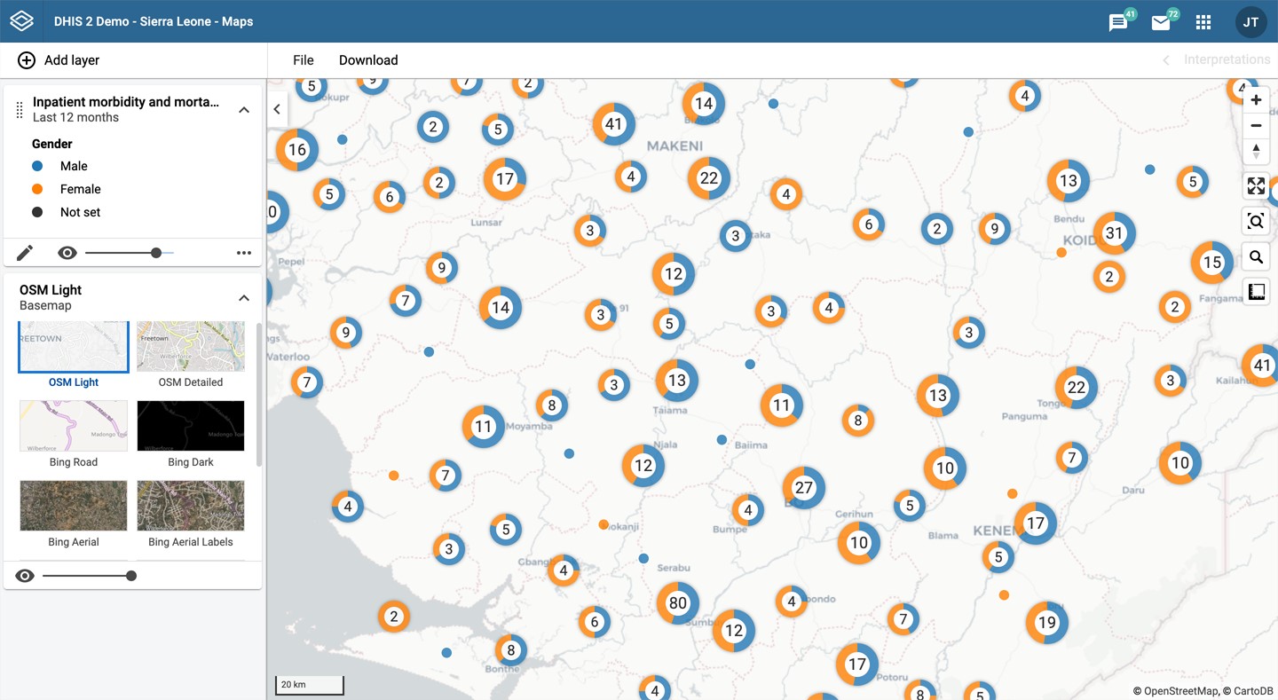
With the Maps app you can overlay multiple layers and choose among different base maps. You can create thematic maps of areas and points, view facilities based on classifications, and visualize catchment areas for each facility. You can add labels to areas and points, and search and filter using various criteria
DHIS2 Pivot Table
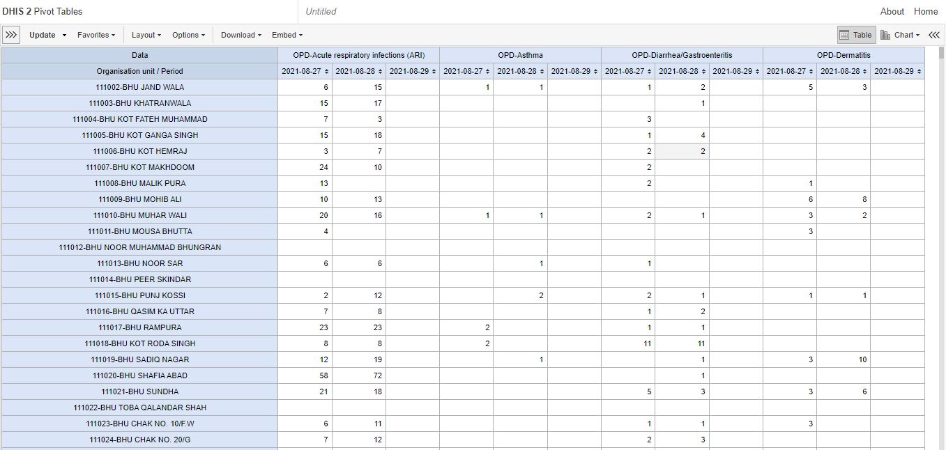
With the Pivot Table app, you can create pivot tables based on all available data dimensions in DHIS2. A pivot table is a dynamic tool for data analysis which lets you summarize and arrange data according to its dimensions. Examples of data dimensions in DHIS2 are: Data dimension itself (for example data elements, indicators and events), Periods (representing the time period for the data), organisation hierarchy (representing the geographical location of the data).
DHIS Tutorials
DHIS2 Software has Six basic Forms/Tools for keeping record of different areas of a Health Facility .
DHIS Overview
This tutorial will give you Introduction on how to use DHIS2 along with complete step to step guide about data entry.Data Visualizer
This tutorial will guide you about Data Visualizer and how we can use it to detect outliers in our system.Data Visualizer - Disaggregations , Layout and Chart options
In this tutorial you will learn how you can generate different kind of reports in DHIS2.Creating and Editing Dashboards in DHIS2
In this tutorial you will learn how you can create Dashboards of your own and add multiple graphs, pivot tables and maps for your analysis.User Guide DHIS2
Want to know about background and purpose of DHIS2? Or need instructions on how to use it? These guides explain how to perform tasks such as data entry, meta-data set-up, import and export of data, aggregation, reporting and other topics related to the usage of the software.